
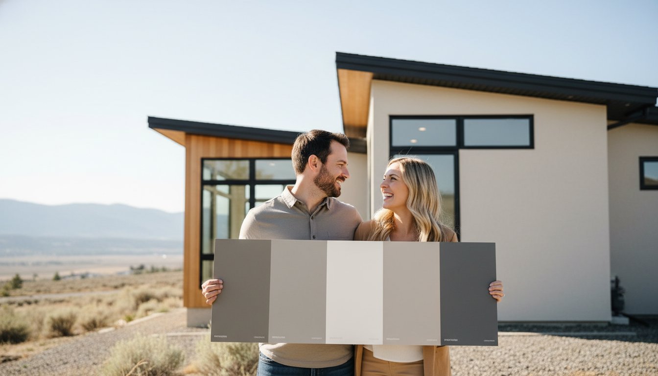
Last Saturday, you stood in the paint aisle clutching a handful of "perfect" greige swatches, only to have your partner dismiss every single one in seconds. It's a common frustration, and you quickly realize that convincing my spouse on a house color is often more challenging than the actual renovation. You want a home that feels revitalized and sophisticated, but decision paralysis sets in when every choice feels like a potential ten-year mistake. It's exhausting to handle the fear of picking an undertone that shifts unexpectedly once it's applied to your walls.
We believe that your environment should be a source of harmony, not a point of contention. This guide provides a professional framework to resolve these color conflicts and choose a paint palette you both love without the typical arguments. You'll discover how to move away from subjective opinions and use objective tools like Light Reflectance Value and lighting science to find the right fit. We'll explain how to test samples accurately and build a cohesive look that satisfies both your aesthetic goals and your partner's concerns, ensuring a result that looks expertly executed and stands the test of time.
Key Takeaways
- Shift from subjective opinions to objective data by leveraging Light Reflectance Value (LRV) to determine exactly how a color will perform in your specific environment.
- Eliminate the frustration of convincing my spouse on a house color by understanding the biological and psychological factors that influence how each person perceives pigment.
- Adopt the "Large Format" sampling method to accurately visualize undertones and avoid the common pitfalls of relying on small store swatches.
- Discover how warm minimalism and complex neutrals can bridge the gap between different design styles for a result that satisfies both parties.
- Learn when to involve a professional painting consultant to act as an expert third party and ensure your chosen palette enhances your home's unique architectural features.
The Psychology of Color Conflict: Why You and Your Spouse See Differently
Color disagreement is the primary hurdle in almost every home renovation project we encounter. It's rarely a matter of one person being right and the other being wrong. Instead, the friction usually stems from the fact that no two people perceive pigment in exactly the same way. When you find yourself convincing my spouse on a house color, you're often fighting against biological and psychological predispositions that you aren't even aware of. This isn't just about taste; it's about how your brains process visual data.
Physiological factors like gender, age, and eye color subtly shift your reality. Research indicates that women are often more adept at distinguishing between subtle shifts in hue, particularly in the middle of the color spectrum. Age also plays a role, as the lens of the human eye naturally yellows over time, making cool blues and violets appear more muted. Even eye color can impact light sensitivity, meaning a bright white that feels "crisp" to one person might feel "blinding" to another. These differences turn a simple paint choice into a complex negotiation of physical perception.
We often see a "boring beige" versus "bold statement" dynamic play out between couples. One partner seeks the safety of neutrals to avoid a costly mistake, while the other craves a space that reflects a unique personality. The Psychology of Color suggests that these preferences are tied to our emotional needs for either stimulation or tranquility. When you introduce too many swatches at once, you trigger "Visual Overload." This leads to decision paralysis, where the brain shuts down because it can no longer process the minute differences between twenty shades of off-white.
Understanding Aesthetic Values vs. Trends
It's vital to distinguish between a partner who fears change and one who simply dislikes a specific trend. Often, a "no" is actually a defense mechanism against a "core fear," such as the worry that a dark charcoal will make a room feel like a cave or that a trendy terracotta will look dated in two years. Nostalgia also influences these choices. A certain shade of green might remind one spouse of a peaceful childhood garden while reminding the other of a dismal school hallway. Identifying these underlying associations helps move the conversation from "I hate that" to "This makes me feel uncomfortable because..."
Setting Ground Rules for the Color Conversation
To keep the process professional and stress-free, we recommend establishing clear communication boundaries before you even open a fan deck. You can find more tips on managing your project on our painting blog. Use these rules to keep the momentum:
- Ban the word "ugly." Replace it with technical feedback, such as "this has too much yellow undertone" or "this is too saturated for this room."
- Limit the options. Never look at more than three swatches at a time to prevent choice fatigue.
- Define the room's purpose first. Decide if the space is for high-energy social gatherings or low-energy relaxation before discussing specific colors.
- Focus on the goal. Remember that you're seeking a revitalized environment that provides peace of mind for both of you.
Using Light and LRV as Your Neutral Decision Makers
Stop guessing and start measuring. When you're stuck in the process of convincing my spouse on a house color, relying on subjective feelings usually leads to a stalemate. Instead, introduce the Light Reflectance Value (LRV) into your discussion. LRV is an objective scale from 0 to 100 that measures how much light a paint color reflects versus how much it absorbs. A color with an LRV of 80 will make a dark hallway feel expansive, while a color with an LRV of 20 might create the "cave" your partner is trying to avoid. Using this data removes the "I just don't like it" factor and replaces it with technical proof of how the space will function.
In Kamloops, our seasonal light is distinct and powerful. The crisp, bright winters and intense summer sun can make a single swatch look like two completely different colors depending on the month. We recommend using a compass on your smartphone to identify which direction your windows face. This simple step often settles the debate by narrowing your choices based on factual lighting conditions rather than personal preference. It's about finding a palette that revitalizes your home regardless of the season.
North vs. South-Facing Rooms: The Great Tie-Breaker
North-facing rooms receive consistent, cool light that can make popular cool greys appear flat or even depressing. If your spouse hates a specific grey, it might be because the blue-toned light in a North-facing room is draining the color's life. Suggest a warmer neutral to balance that cool cast. Conversely, South-facing rooms are flooded with warm, intense afternoon sun. Here, cooler undertones work beautifully to prevent the space from feeling overheated. If the natural light isn't helping, check your light bulbs' Kelvin ratings. Swapping a warm bulb for a "daylight" bulb can sometimes fix a color your partner currently dislikes.
The 60-30-10 Rule for Harmonious Compromise
If you both have vastly different tastes, you don't have to choose just one direction. Use the 60-30-10 rule: allocate 60% of the room to a dominant "safe" color, 30% to a secondary shade, and 10% to a bold accent. This allows the risk-averse partner to feel comfortable with the majority of the space while giving the bolder spouse a chance to shine with an accent wall or trim. This mathematical approach simplifies the task of convincing my spouse on a house color by providing a clear place for every preference. The 60-30-10 rule is a professional design framework that maintains marital peace by providing a structured ratio for combining safe neutrals with the bold accents you both desire.
If the technical side of lighting feels overwhelming, our team can help you navigate these variables during a residential painting consultation to ensure your vision is brought to life with accuracy.
The Middle Ground: Modern Neutrals for Kamloops Homes
Finding a palette that satisfies both a lover of bold colors and a devotee of safe neutrals often feels impossible. Complex neutrals serve as the essential bridge in this scenario. These are colors that possess enough depth to feel "decorated" without overwhelming the space with high-intensity pigment. In the BC Interior, where our natural light shifts from harsh summer sun to muted winter greys, these sophisticated shades provide a stable backdrop that revitalizes your home. When you are convincing my spouse on a house color, presenting these as a "living" neutral can often break the stalemate.
The 2026 trend of "Warm Minimalism" is the perfect compromise style for modern Kamloops residences. It moves away from the clinical, cold whites of the past and embraces hues with organic, earthy foundations. This approach acknowledges The Psychology of Colors, which suggests that warmer tones can foster a sense of security and comfort. Often, the real source of a color argument isn't the color itself, but the hidden undertones. A grey that looks "perfect" in the store might reveal a "sad" blue or "muddy" green undertone once it hits your walls. Identifying these undertones early allows you to select a shade that feels intentional rather than accidental.
To simplify your decision, we recommend starting with these "Fail-Safe" neutrals that have proven successful in diverse lighting conditions:
- Greek Villa: A soft, sunny white that feels warm but never yellow.
- Shoji White: A versatile greige that bridges the gap between warm and cool.
- Nebulous White: A crisp, modern choice that maintains its integrity in bright afternoon sun.
- Natural Tan: A sophisticated neutral that provides a grounded, earthy feel without looking dated.
The Rise of "Greige" and Warm Whites
Warm whites are currently dominating the local market because they satisfy the need for brightness while feeling intentionally designed. These shades are particularly effective at complementing the natural wood trim or honey-oak flooring found in many Kamloops houses. If you're looking for more specific inspiration, explore our guide on 2026 Paint Colour Ideas for Kamloops Homes to see how these trends translate to our regional architecture.
Using Accent Walls to Satisfy Bold Tastes
If one partner still craves high-impact color, an accent wall is the ultimate creative zone for compromise. We suggest placing the accent on the wall behind a bed or a sofa to provide a focal point that doesn't dominate the entire room's visual field. This allows you to indulge in a bold navy or forest green while keeping 90% of the space in a calming neutral. For those seeking a truly high-end result, consider Professional Wallpaper Installation as a sophisticated alternative to a painted accent wall. It's a great way to introduce texture and pattern that can make the process of convincing my spouse on a house color much smoother by offering a more finished, artisanal look.
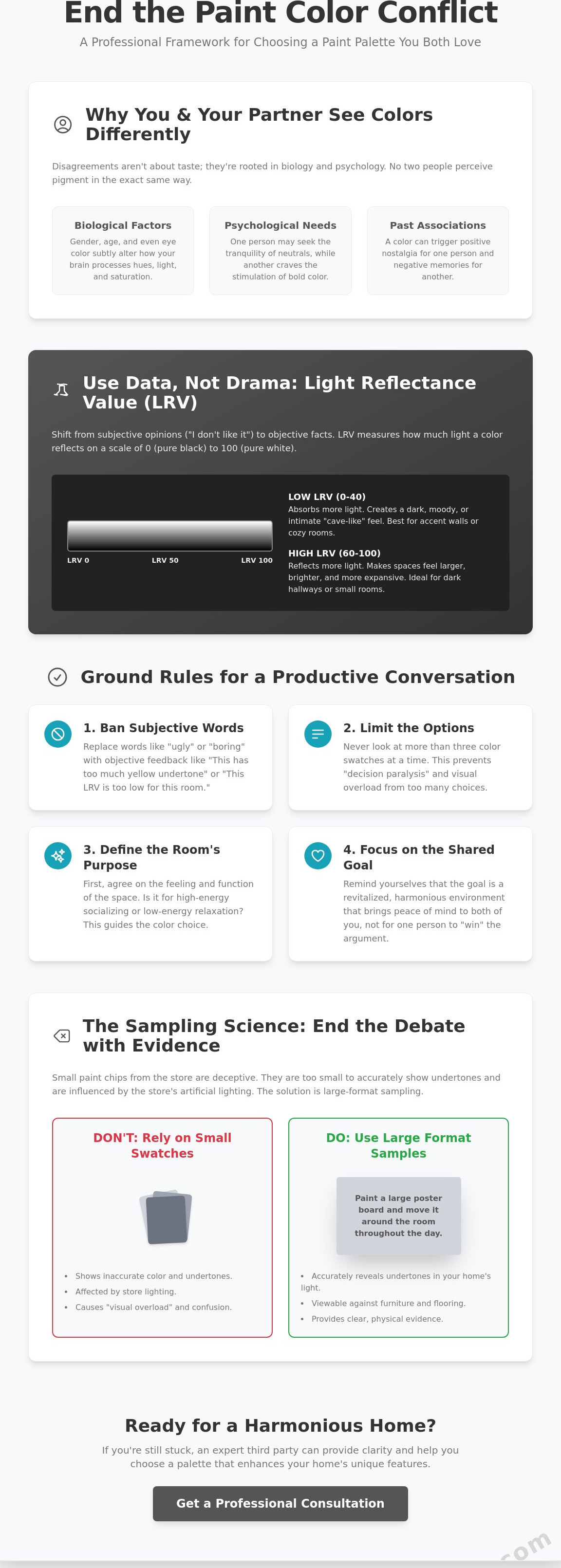
The Sampling Science: Ending the Debate with Physical Evidence
Don't rely on the tiny, two-inch swatches provided by the local hardware store. These small paper squares are designed for convenience, not for accuracy, and they rarely reveal the true character of a pigment. When you're in the middle of convincing my spouse on a house color, physical evidence is your strongest ally. We recommend the "Large Format" rule, which dictates that you should use samples measuring at least 12x12 inches. A larger surface area allows the hidden undertones of a paint to emerge, showing you exactly how a "neutral" grey might lean toward a cold blue or a muddy green once it's applied to a full wall.
Once you have your large-format samples, move them around the room throughout the day. A color that looks inviting at 8:00 AM in the soft morning light might feel oppressive or overly saturated by 1:00 PM. We suggest you "live with the color" for at least 48 hours before holding a final vote. This period allows both you and your partner to see the palette under various conditions, including the home’s actual LED or incandescent bulbs at night. This technical approach shifts the conversation from a battle of opinions to an observation of facts, providing the peace of mind that comes with a well-informed decision.
The White Border Trick
One of the most effective ways to isolate a sample is to use a white poster board as a border. If you paint a sample directly onto your current wall, the existing color will bleed into your perception of the new one. The human eye does not perceive color in isolation, but rather interprets hues based on the proximity and contrast of surrounding shades. By placing your sample against a clean white background, you eliminate color reflection from the old paint. This trick often stops the "it looks too green" argument by showing the color’s true identity without interference from the current environment.
Testing Under Kamloops Skies
Our regional climate requires a specific approach to testing. The high altitude and clear air in the BC Interior often result in higher light intensity, which can cause colors to appear more vibrant or "washed out" than they seemed in a store. You must test your samples during our smoky summer days and our bright, snowy winters to see how the atmosphere shifts the palette. Snowy conditions can reflect an enormous amount of blue light into your home, while summer smoke creates a warm, orange filter. Seeing how your chosen shade reacts to these local extremes ensures a result that looks professional year-round.
If you want to ensure your home's transformation is handled with technical precision, our team provides expert residential painting services that take the guesswork out of color selection.
When to Bring in a Professional Kamloops Painting Consultant
Sometimes, even with the best technical data and large-scale samples, a stalemate persists. This is the moment to involve a professional consultant who acts as a neutral third party with no emotional stake in the argument. We find that convincing my spouse on a house color becomes much easier when the recommendation comes from an expert who views the home through the lens of architectural integrity rather than personal preference. A professional walkthrough allows us to identify specific features, such as the undertones in your stonework or the way your vaulted ceilings catch the light, that should dictate the palette. This shifts the focus from a battle of opinions to a collaborative effort to revitalize your environment.
A formal color consultation is a strategic investment that prevents the psychological and financial stress of a "wrong" choice. Repainting a room because the color feels "off" is an expensive mistake that often leads to further domestic friction. By leveraging professional tools and a deep understanding of pigment behavior, we provide the peace of mind that your chosen palette will look exactly as intended. We help you move past the "Color War" and transition into the excitement of transformation, ensuring the final result satisfies both parties and enhances your home's long-term value.
Expertise Over Opinion
At BC Interior Painting Pros, we draw on 20 years of experience to guide Kamloops homeowners through these complex decisions. We don't just perform a manual labor task; we operate with an artisan's mindset, focusing on how a space feels and functions after the final coat is dry. Our commitment to accuracy and attentiveness ensures that your vision is brought to life with technical precision. You can learn more about our approach by visiting our page on Expert Painters in Kamloops, where we detail our dedication to transforming homes with care.
Next Steps: From Decision to Done
Once a professional recommendation is on the table, it's easier to present the final choice to your spouse as a verified, expert-backed solution. This reduces the friction of convincing my spouse on a house color because the decision is no longer about winning an argument. We support this transition with a customer-first process that is clean, efficient, and transparent. Our team handles the heavy lifting, allowing you to focus on the tangible value of a job well done. If you're ready to end the debate and start the revitalization of your home, book your free Kamloops painting estimate and color consultation today.
Transform Your Home with Shared Confidence
Navigating the complexities of color perception doesn't have to stall your renovation. By understanding the science of lighting and leveraging objective data like Light Reflectance Value, you can move away from subjective arguments and toward a revitalized environment. Convincing my spouse on a house color becomes a collaborative process when you rely on physical evidence and accurate sampling. These professional frameworks ensure that your final palette provides long term peace of mind rather than lasting regret.
We take pride in our history as a locally owned and operated business with over 20 years of experience serving the Kamloops community. Our team approaches every project with artisan quality; we prioritize accuracy and attentiveness to ensure your vision is brought to life. Because we understand the importance of getting the palette right, a professional color consultation is included with all major projects. We're here to help you navigate the technical variables and achieve a result that satisfies both parties. Let our experts help you find the perfect compromise; Book a Free Estimate today and take the first step toward a harmonious home transformation.
Frequently Asked Questions
What if my spouse hates the color after it is already on the walls?
Wait at least 48 hours for the paint to fully cure and for your eyes to adjust to the change. Fresh paint often appears more intense before the room is fully staged with furniture, rugs, and artwork. If the dislike persists after two days, a professional can often suggest lighting adjustments or decorative accents to shift the tone before you commit to a full repaint.
How many paint samples should we realistically try before deciding?
Limit your final selection to three or five samples to prevent decision paralysis. Looking at dozens of swatches creates visual overload and makes the process of convincing my spouse on a house color significantly harder. Focus on high-quality, large-format samples that represent different undertones within your chosen color family. This allows you to see how each pigment reacts to your specific architectural features.
Is there a "universal" paint color that most couples agree on?
Complex neutrals like Shoji White or versatile greiges are often the most successful compromise because they balance warm and cool tones. These shades provide a sophisticated backdrop that works with most flooring and furniture styles. They are reliable choices that revitalize a space without feeling too bold for the risk-averse or too clinical for those wanting a more decorated character.
Should we pick the furniture or the paint color first?
You should always select your furniture and textiles before your paint color. It is much easier to find a paint shade that complements a specific sofa or rug than it is to find furniture that matches a pre-painted wall. Since paint colors are virtually infinite while upholstery options are limited, use your primary decor pieces to dictate the essential undertones of your new palette.
How do I convince my partner that a dark color won’t make the room look small?
Explain that dark colors create depth by causing the walls to recede visually. When you use a high-quality, saturated hue in a room with proper lighting, it creates an intimate, sophisticated atmosphere rather than a cramped one. Point out that painting the trim and ceiling the same dark shade can actually make the boundaries of the room disappear; this makes the space feel more cohesive and expansive.
Can a professional painter help us settle a color disagreement?
Yes, a professional painter acts as a technical advisor who can explain why certain colors will or will not work in your specific environment. We use our experience to move the conversation from personal opinion to architectural reality. By identifying fixed elements like flooring and natural light, we provide an objective recommendation that helps in convincing my spouse on a house color with confidence.
What are the most popular neutral colors for Kamloops homes in 2026?
Current favorites in the BC Interior include warm, earthy whites and soft taupes like Greek Villa and Natural Tan. These shades complement our regional landscape and provide a sense of warm minimalism. Homeowners are moving away from cool, sterile greys and embracing colors that offer more organic depth. These choices provide a welcoming atmosphere that feels both modern and grounded in our local environment.
How does the lighting in Kamloops affect how paint colors look inside?
Kamloops experiences high light intensity and clear air, which often makes colors appear more vibrant or washed out than in coastal regions. Our snowy winters reflect cool, blue light into rooms, while smoky summers can add a warm, orange cast. Testing your samples during these seasonal shifts is crucial to ensure the color remains accurate and professional-looking throughout the entire year.


