
That "perfect" greige you saw on Pinterest might actually turn a depressing shade of violet the moment the sun sets over Mt. Peter and Mt. Paul. It's a common frustration for Kamloops homeowners who find that standard neutral colours often look muddy or cold under the unique atmospheric conditions of the Thompson Valley. You want a home that feels bright and modern, but staring at a wall of 3,500 different beige swatches can quickly lead to decision fatigue.
We understand that a fresh coat of paint is an investment in your peace of mind and your home's future. This 2026 guide teaches you how to select light-calibrated palettes that handle our intense summer glare and muted winter skies with ease. By choosing the right tones, you can elevate your interior and potentially increase your property value by as much as 5% according to 2024 market data. We'll show you how our team delivers a flawless finish that makes your space feel larger, more inviting, and perfectly tailored to the local landscape. You're about to learn the secrets of precision and care in every stroke to ensure your home remains a sophisticated sanctuary all year round.
Key Takeaways
- Understand the "Kamloops Effect" to select a palette that harmonizes with the Thompson Valley's unique natural light cycle.
- Master the technical side of Light Reflectance Value (LRV) to ensure your selected neutral colours stay bright without looking muddy or grey.
- Explore 2026 design trends that favor warm mushroom and taupe tones over the cold, stark whites of previous years.
- Learn to match paint temperatures to your room's window orientation to balance the intense glare of a South-facing Kamloops afternoon.
- Discover why professional surface preparation is the secret to achieving a flawless, sophisticated finish that elevates your home's value.
Why Neutral Colours are the Foundation of Kamloops Interior Design
In the Thompson Valley, our environment is defined by dramatic shifts in light and landscape. From the sage-covered hills of Batchelor Heights to the deep greens of the surrounding forests, the exterior world is vibrant and ever-changing. Neutral colours provide the necessary visual anchor for these homes, creating a sophisticated foundation that doesn't compete with the view outside. Modern neutrals in 2026 have evolved far beyond the flat whites or dated beiges of the past; they now include complex, layered tones like mushroom, soft taupe, and organic clay.
This "Kamloops Effect" means your interior walls must be light-calibrated to handle the intense summer sun without feeling washed out or overly yellow. A well-chosen neutral palette also has a profound psychological impact, offering a sense of calm and order. It transforms a house into a sanctuary, providing a peaceful retreat from the busy pace of daily life. Our team delivers these high-end shades to ensure your home feels both grounded and spacious, reflecting the natural beauty of the BC interior.
The Versatility of the Modern Neutral Palette
One of the greatest strengths of a neutral backdrop is its ability to highlight local craftsmanship and natural materials. Many Kamloops homes feature stunning cedar beams or custom natural wood flooring that can easily be overwhelmed by bold paint choices. By using Transitional interior design principles, you can blend traditional warmth with contemporary lines. This style relies heavily on neutral colours to create a seamless flow between rooms. As we move into 2026, we're seeing a definitive shift away from the cold "Millennial Grey" toward warmer "Greiges" that feel more inviting during our long winter months.
Maximizing Resale Value in the Kamloops Real Estate Market
For homeowners looking to increase property value, a professional coat of neutral paint is one of the most cost-effective upgrades available. Local real estate data from 2024 suggests that homes with updated, neutral interiors sell faster than those with personalized, bright accent walls. Buyers view a neutral space as a premium "blank canvas" where they can easily visualize their own belongings. This is particularly effective in the classic ranchers found in neighborhoods like Sahali or Dufferin, where a unified colour scheme makes smaller floor plans feel significantly more expansive. Hiring professional interior painting services Kamloops ensures these light shades are applied with precision and care in every stroke, resulting in a flawless, high-end look that helps elevate your home's market appeal.
Understanding Undertones and LRV in Thompson Valley Light
Paint doesn't exist in a vacuum. It's a reactive material that changes its personality based on the light it reflects. In Kamloops, our high-altitude sunlight is particularly crisp and intense, which makes selecting neutral colours a technical challenge. What looks like a soft, sandy beige in a Vancouver showroom can easily transform into a jarring yellow once it hits the walls of a home in Juniper Ridge. Achieving a sophisticated look requires a deep understanding of how light interacts with pigment.
Decoding Light Reflectance Value (LRV)
Light Reflectance Value, or LRV, is a scale from 0 to 100 that measures the percentage of light a paint colour reflects. Pure black sits at 0, while absolute white reaches 100. For most Kamloops living rooms, we find that an LRV between 60 and 70 is the ideal "sweet spot." This range provides enough brightness to feel airy during our dry, sun-drenched summers while retaining enough pigment to avoid looking washed out during a grey December afternoon. If you're designing a moody, sophisticated home office, choosing a neutral with a lower LRV of 35 to 45 can create a grounded, scholarly atmosphere. The paint finish also plays a role; a meticulous matte finish will absorb light for a soft look, whereas an eggshell finish reflects more light, subtly increasing the perceived LRV of the room.
The Battle of the Undertones: Pink, Green, and Blue
Every neutral paint has a hidden "identity" known as an undertone. These are the subtle hues that emerge when a colour is applied to a large surface. You can spot these by comparing your swatch against a piece of pure white printer paper. In North Kamloops, where homes often deal with a cooler, blue-ish light during the winter months, we typically recommend neutrals with warm undertones to prevent the space from feeling icy. To ensure your chosen shade remains true, our team always recommends starting with a high-quality pva primer. This step is vital because it seals the drywall and prevents the previous wall colour from bleeding through and distorting your new palette.
Our local geography means our sunlight is often filtered through the dry, golden grasses of the valley, which can intensify warm undertones. A "safe" cream can quickly begin to look like a bright canary yellow. This is why we perform meticulous colour testing. We suggest viewing your samples at 8:00 AM, 1:00 PM, and 7:00 PM to see how the shifting Thompson Valley sun affects the walls. If you want to ensure your palette remains flawless under every condition, you might consider having our experts provide a professional color assessment before the first drop of paint is applied. This precision and care in every stroke ensures your investment delivers the exact aesthetic you envisioned.
Warm vs. Cool Neutrals: Choosing for Your Room Orientation
The orientation of your windows acts as a natural filter for your paint. In the Thompson Valley, where the sun's trajectory creates high-contrast shadows against our hills, your room's direction dictates the temperature of the light. Choosing neutral colours without considering this factor often leads to rooms that feel unintentionally gloomy or aggressively bright. According to 2024 regional design surveys, nearly 70% of homeowners regret their paint choice because they didn't account for how the light shifts throughout the day.
Our team specializes in light-calibration for local homes, ensuring your chosen palette looks intentional and sophisticated. We understand that a shade that feels inviting in a West-facing sunroom at 4:00 PM might look like a cold slab of concrete in a North-facing bedroom at dawn. By matching your paint temperature to your window orientation, we help you create a space that feels balanced and premium.
The Best Neutrals for North and East Facing Rooms
North-facing rooms are the most challenging because they receive consistent, cool light that lacks the golden warmth of the afternoon sun. To counteract this, we recommend selecting "creamy" whites or neutrals with subtle red or yellow undertones. These shades add a necessary warmth that prevents the space from feeling sterile or uninviting. If you're looking for a modern look, "Greige" is an excellent compromise. It bridges the gap between grey and beige, providing a sophisticated backdrop that remains cozy even during a snowy Kamloops morning. We advise you to avoid cool-toned greys in these areas; they tend to pick up the blue light from the sky, often resulting in a "basement feel" that lacks life.
Managing Light in South and West Facing Rooms
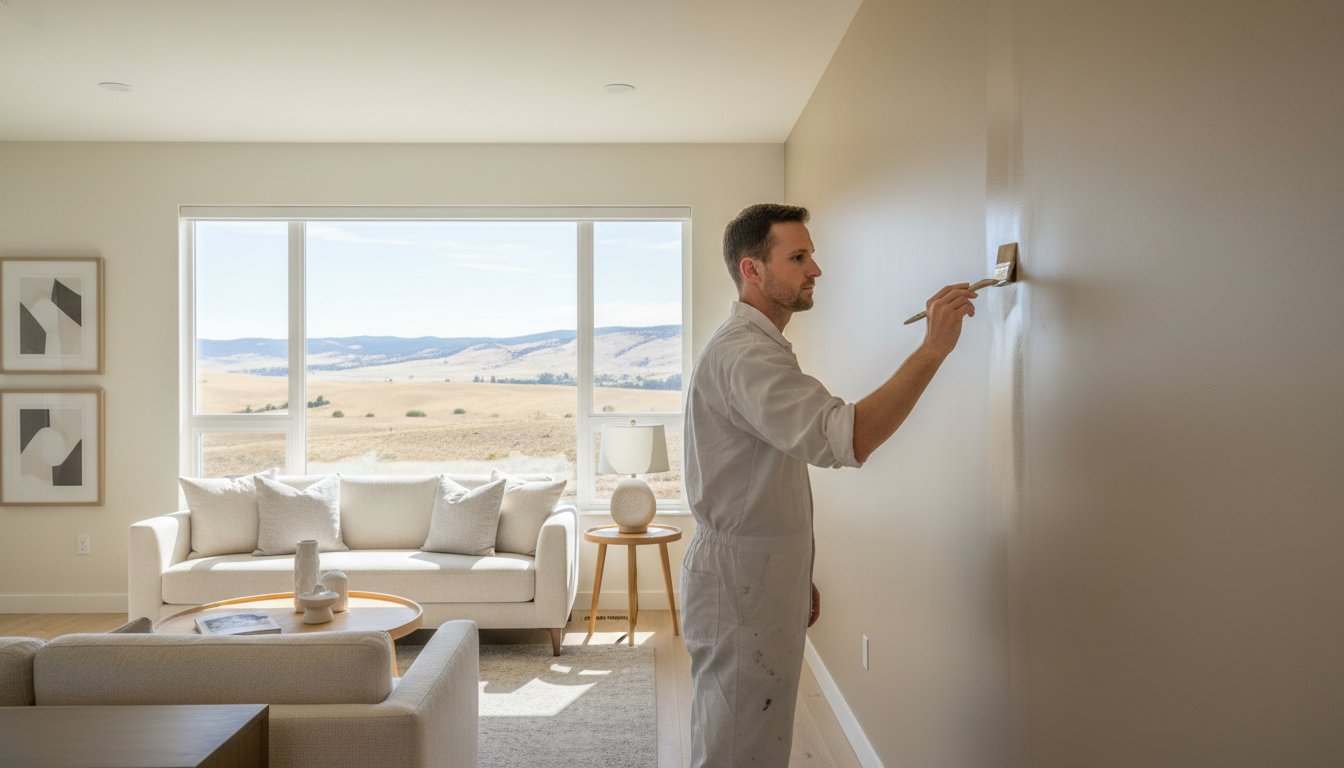
South and West facing rooms in Kamloops are flooded with intense, warm light, especially during the peak summer months. While this light is beautiful, it can make warm-toned neutrals look orange or muddy. In these spaces, we suggest using cool-toned neutrals with green or blue undertones. These shades "temper" the golden hour heat, keeping the room feeling fresh and balanced. High-glare areas require a strategic approach to finish. Using a flat or matte sheen can help reduce reflections that make walls look "washed out" when the sun is at its peak. Engaging professional painters ensures you select the correct premium product and sheen level to handle this exposure. Our team delivers a flawless application that manages glare with precision and care in every stroke, ensuring your space remains elegant even when the sun is at its most powerful.
In addition to choosing the right paint finish, you can check out Save On Blinds for custom window coverings that provide another layer of protection against the intense Thompson Valley sun.
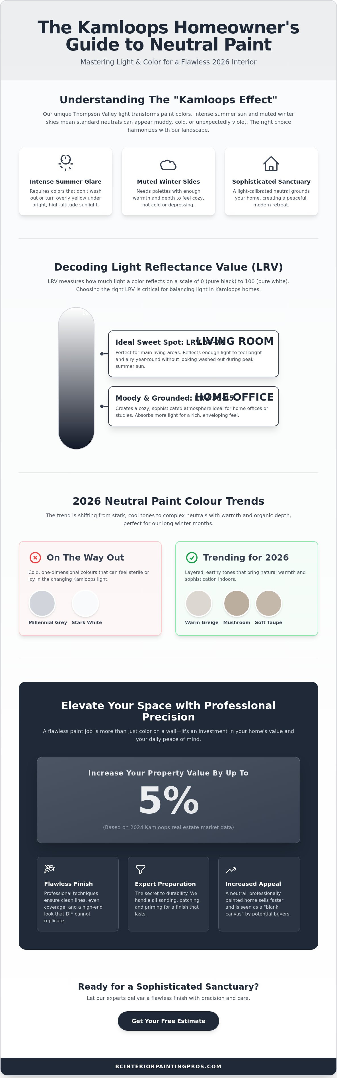
Top Neutral Paint Colour Trends for Kamloops Homes in 2026
The design landscape for 2026 marks a definitive departure from the stark, industrial aesthetics of the early 2020s. Homeowners across the Thompson Valley are prioritizing warmth and organic connection, moving away from the "cool grey" era. This shift is reflected in a 22% increase in requests for earth-toned neutral colours compared to data from early 2024. These new palettes don't just sit on the surface; they add a layer of sophisticated depth that makes a home feel established and serene.
The "New" Neutrals: Earthy and Grounded
Mushroom, taupe, and muted clay have officially replaced the sharp whites and greys of the past decade. These shades are particularly effective in Kamloops because they harmonize with the natural sagebrush and sun-scorched hills visible from many of our windows. Applying these more saturated neutrals requires a steady hand to avoid visible lap marks or uneven coverage. Our team understands that achieving a premium look with these complex tones demands precision and care in every stroke. When these colours are paired with natural wood features or stone hearths, they create a cohesive, high-end environment that feels deeply rooted in the BC interior. This level of technical skill is a hallmark of any artistic discipline, whether you are finishing a living room or learning professional techniques through a Face Painting Course Online.
Timeless Whites and Off-Whites
While trends evolve, white remains a staple for its clean and airy feel. However, 2026 is the year of the "organic white", which are shades that contain a drop of warmth to keep them from feeling clinical. Our team has curated a selection of the best benjamin moore off white colours to help you navigate these subtle differences. The three most requested shades by painters Kamloops this year include soft linens, creamy alabasters, and whites with a hint of green undertone. To elevate these walls, we suggest using a slightly brighter white for the trim to create a crisp, tailored contrast. For a modern edge, many clients are now using matte black as a neutral accent on window frames or interior doors to ground the lighter walls.
Texture is the final element that brings a neutral palette to life. Integrating woven fabrics, light oak, and matte metals ensures your space feels layered rather than flat. If you're ready to revitalize your environment with the latest trends, schedule a professional consultation with our team to discover how these 2026 palettes can transform your home.
Creating a beautiful environment goes beyond paint; it’s also about the lifestyle and amenities available in your community. For those looking for inspiration on how local culture and shopping districts define a neighborhood's appeal in other vibrant hubs, check out CalgaryListings (Tost Realty Group).
Elevating Your Space: Why Professional Precision Matters
Light neutral colours are notoriously unforgiving. While a deep charcoal or navy might mask minor wall imperfections, a soft off-white or pale mushroom acts like a spotlight on every dent, scratch, or poorly sanded patch. Achieving a flawless, high-end finish requires more than just a brush; it requires a meticulous eye for detail and a deep understanding of paint chemistry. To see how professional standards are applied to high-end home transformations, you can learn more about Harbour and Hayes and their approach to decorating and finishing. Many DIY enthusiasts discover that light neutrals are prone to "flashing," where the sheen looks uneven, or visible lap marks that ruin the sophisticated aesthetic. We eliminate these risks by applying technical expertise developed over twenty years of serving the Thompson Valley.
Superior results start long before the first can of paint is opened. Many Kamloops homes feature complex textures like stucco or older drywall that has settled over time, creating subtle ridges and cracks. We prioritize comprehensive surface preparation as a non-negotiable step in our process. This includes repairing drywall damage and ensuring a perfectly smooth substrate. This foundational work ensures that the premium pigments in your chosen palette sit perfectly on the wall, reflecting light exactly as intended. Our no-surprises approach means you receive a clear, transparent plan before we begin, prioritizing reliability and your peace of mind.
In addition to traditional wall applications, achieving a factory-smooth finish on cabinetry or metal fixtures often requires specialized techniques. Professionals like SKR Specialists excel in this area, offering high-quality respray services that complement a professional interior paint job by ensuring every surface in your home looks pristine.
To ensure every surface in your home stays as pristine as the day it was painted, professional services like Pure Breeze Clean offer the expert care needed to maintain a sophisticated and clean living environment.
The BC Interior Painting Pros Difference
Our commitment to precision and care in every stroke is the standard we bring to every job site. We believe a professional service should do more than just change a wall's colour. Our team delivers a total revitalization of your living environment. By combining premium products with expert skill, we elevate your space into a sophisticated sanctuary. This dedication to quality is why we remain a trusted choice for homeowners who value long-term results over quick, temporary fixes. We take pride in our heritage and view every project as an opportunity to reinforce our reputation for excellence; this same level of professional attention is essential in other areas of life, such as when Padden Dental provides advanced restorative and cosmetic dental solutions for those seeking a personal revitalization.
Finalizing Your Vision: From Swatch to Success
Moving from a small paint swatch to a fully transformed interior is a significant transition. We offer professional colour consultations to help you finalize your 2026 palette with total confidence. During this session, we analyze your room's unique lighting and architectural features to ensure your chosen neutral colours perform exactly as expected under the Kamloops sun. If you're ready to revitalize your home, you can easily book a consultation for residential painting near me through our website. Trusting your renovation to experts with a twenty-year legacy ensures a flawless finish that adds tangible value to your property and enhances your daily life.
Transform Your Interior with Confidence
Selecting the perfect palette for your home is about more than just picking a shade from a book. It's about understanding how the crisp Thompson Valley light interacts with neutral colours to create a space that feels both modern and welcoming. By balancing technical factors like LRV with the warm, earth-toned trends of 2026, you can ensure your interior remains a sophisticated sanctuary for years to come.
A flawless application requires the meticulous touch of a Trusted Craftsman. Our fully insured team brings over 20 years of local experience to every project, specializing in premium applications using Benjamin Moore and Sherwin-Williams products. We focus on the details that DIY projects often miss, from precise surface preparation to the final, flawless coat. Elevate your home with a professional neutral palette; get your free estimate from BC Interior Painting Pros today!
We look forward to helping you revitalize your environment and bringing your vision to life with precision and care in every stroke.
Frequently Asked Questions
What are the most popular neutral paint colours for Kamloops homes in 2026?
In 2026, the most popular neutral colours are earth-toned shades like mushroom, taupe, and organic clay. These warmer, grounded tones are officially replacing the stark, industrial greys that dominated the last decade. We're seeing a high demand for whites with soft linen or creamy undertones that reflect the natural beauty of the Thompson Valley hills. These choices help create a sophisticated sanctuary that feels both modern and inviting.
How do I choose between a warm or cool neutral for my living room?
Choose your paint temperature based on the direction your windows face to balance the natural light. North-facing rooms benefit from warm neutrals with red or yellow undertones to counteract cool, blue-ish light. Conversely, South-facing rooms often require cool-toned neutrals with green or blue undertones to temper the intense, golden afternoon glare. This technical approach ensures your space feels balanced and comfortable throughout the entire day.
Does the type of lightbulb I use affect how neutral colours look on my walls?
Lightbulbs significantly alter your wall's appearance because of their specific Kelvin rating. A 2700K bulb emits a warm, yellow glow that can make a crisp neutral look muddy or overly yellow. A 5000K bulb provides a cool, daylight effect that reveals the true blue or green undertones in your paint. We recommend testing your paint samples under the specific LED lighting you plan to use to ensure the result is flawless; for those interested in the technical side of high-resolution LED and stage lighting systems, Northern Signal AV Ltd. offers professional-grade solutions for large-scale events.
Can I use neutral colours for exterior painting in Kamloops BC?
You can certainly use neutral colours for exterior projects, but they require premium, UV-resistant products to handle our local climate. The intense sun in the Thompson Valley can cause lower-quality paints to fade or chalk within 3 to 5 years. Our team applies high-end exterior coatings designed to withstand these temperature swings while maintaining a professional, sophisticated appearance that elevates your home's curb appeal.
What is the best neutral paint colour for a small, dark hallway?
A high LRV off-white is the most effective choice for a small, dark hallway. Look for a Light Reflectance Value of 75 or higher to maximize what little light is available in the space. This technical choice makes narrow corridors feel significantly more open and less restrictive. Using a satin finish in these high-traffic areas also helps reflect light while providing a durable surface that stands up to daily wear.
Should my trim and ceiling be the same neutral colour as my walls?
Using the same colour for trim, walls, and ceilings creates a sophisticated monochromatic look that is very popular in 2026. This technique is particularly effective in modern homes to make ceilings appear higher and eliminate visual clutter. If you prefer a traditional contrast, we suggest a trim colour that is 2 to 3 shades lighter than the walls to provide a crisp, tailored definition that highlights your home's architectural details.
How much does it typically cost to have a professional paint a neutral interior?
Professional painting costs are calculated based on the square footage and the level of meticulous surface preparation required. While we provide custom estimates, 2024 real estate data suggests that a professional interior paint job can offer a return on investment of over 100% when selling a home. We prioritize transparency with a no-surprises approach, providing a clear, detailed estimate before any work begins to ensure your peace of mind.
Why does my grey paint look purple once it is on the wall?
Grey paint often looks purple because it contains hidden red or blue undertones that become visible under certain lighting conditions. This shift frequently occurs in North-facing rooms or in spaces with heavy foliage outside that filters the light. To avoid this, our team performs meticulous on-site testing. We view samples at various times of day to ensure your chosen shade stays true to your vision and delivers a flawless result.


