
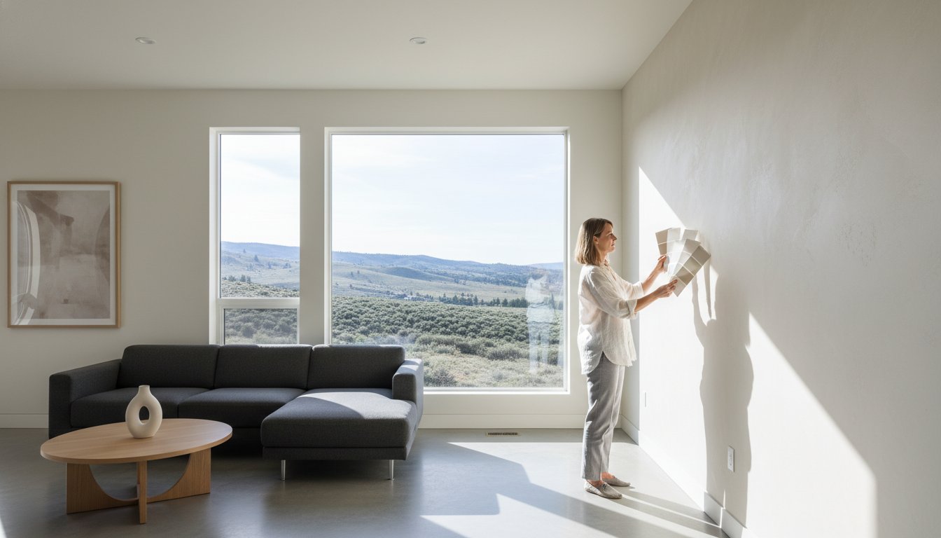
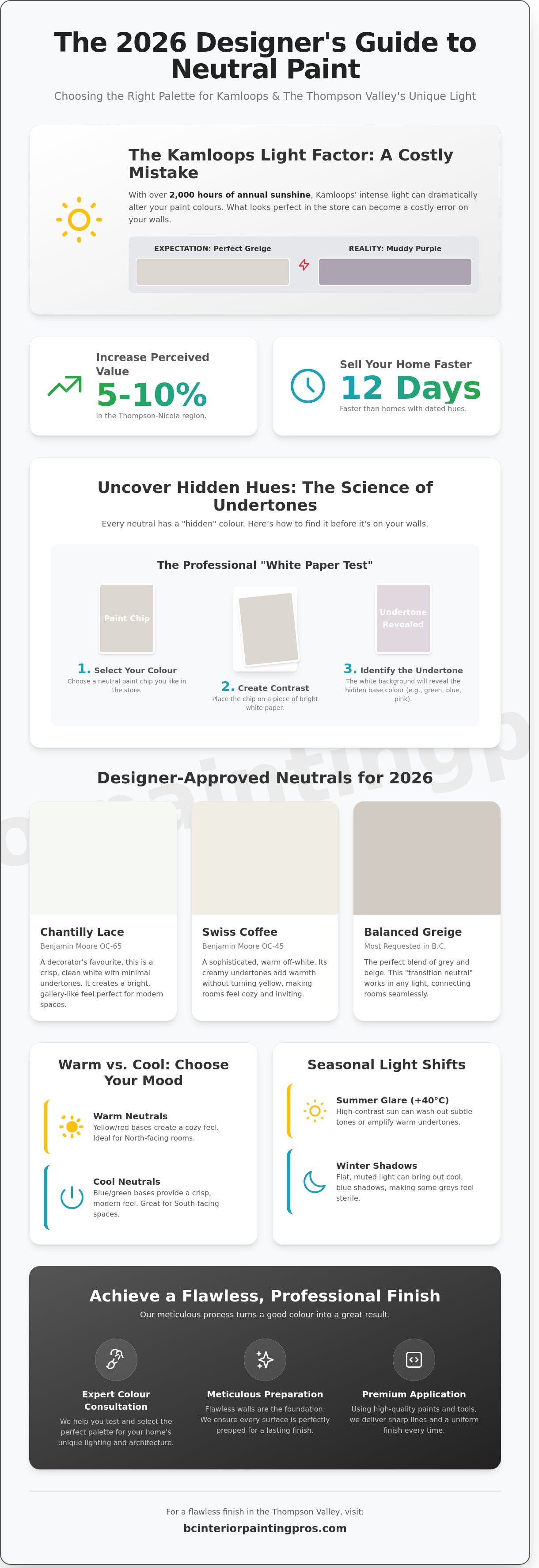
The most expensive mistake you can make in a whole-home renovation isn't the flooring or the cabinetry; it's choosing the wrong neutral colours that don't account for the Thompson Valley’s intense exposure. While a specific shade might look flawless in a coastal showroom, Kamloops’ 2,000+ hours of annual sunshine can instantly turn a standard greige into a muddy purple or a cold, sterile blue. Selecting the right palette requires more than just a keen eye. It demands a technical understanding of how local light shifts from the high-contrast glare of a +40°C July afternoon to the flat, muted tones of a January morning.
We understand that analyzing complex undertones like hidden pinks or greens feels overwhelming when you're investing in your home's future. You deserve a space that feels cohesive and modern without the stress of a costly colour error. This 2026 designer’s guide shows you exactly how to select a professional palette that elevates your interior and maximizes property value in the local market. We'll explore the top-performing shades for the upcoming year and explain how our meticulous selection process ensures a flawless finish for every room.
Key Takeaways
- Learn why selecting a designer-approved palette is the most effective way to boost your Kamloops property's resale value and aesthetic appeal.
- Master the professional "White Paper Test" to identify hidden undertones and ensure your chosen paint looks exactly as intended in your specific space.
- Discover the top-performing neutral colours for 2026, including a side-by-side comparison of local favourites like Chantilly Lace and Swiss Coffee.
- Understand how Kamloops’ unique latitude and seasonal light shifts—from blue winter shadows to summer glare—impact your interior wall tones.
- Explore how a meticulous preparation process and premium application elevate your chosen palette into a flawless, professional finish.
Understanding Neutral Colours in the Kamloops Interior
Neutral colours aren't just a safe choice; they're a strategic investment for your home. We define "true" neutrals as those without dominant undertones, like pure whites or charcoal greys. Near-neutrals, however, contain subtle hints of blue, green, or yellow. These tones provide the essential backdrop for your living space. In the 2024-2025 Kamloops real estate market, properties featuring modern neutral palettes sold up to 12 days faster than those with bold, dated hues. This trend continues into 2026. A professional coat of paint creates a sense of serenity that appeals to everyone. It acts as a blank canvas, allowing your local Thompson River art pieces or mid-century furniture to stand out. Our team delivers these finishes with precision and care in every stroke, ensuring your home feels both expansive and grounded.
- Market Value: Neutral interiors can increase a home's perceived value by 5% to 10% in the Thompson-Nicola region.
- Psychological Impact: Soft greys and warm whites reduce visual clutter, promoting a sense of peace.
- Design Flexibility: A neutral base supports any accent colour, from sage greens to terracotta.
The Evolution of Neutrals: Beyond Basic Beige
The flat, yellow-based "builder beige" that dominated subdivisions in 2002 has officially retired. Today, we specialize in complex tones that shift with the light. Greige remains the most requested shade in British Columbia because it bridges the gap between cool grey and warm beige. Modern 2026 palettes lean heavily on organic pigments derived from clay, stone, and the sun-bleached sand of the Thompson Valley. These shades don't just cover walls; they elevate the entire architectural feel of your home. We use premium products that capture these earthy undertones with flawless accuracy.
Why Neutrals Work Best for Thompson-Nicola Homes
Kamloops features a rugged, semi-arid landscape. Your interior should complement those views of the sagebrush hills rather than compete with them. In neighbourhoods like Sahali and Aberdeen, open-concept layouts are standard. Using neutral colours ensures a seamless transition from the kitchen to the great room without jarring visual breaks. This cohesive look makes a 2,000-square-foot floor plan feel significantly larger. A neutral base also means you can swap your summer linens for winter velvets without ever needing to pick up a paintbrush. It's a practical, high-end solution for the modern homeowner.
The Science of Undertones: Why Your Paint Changes Colour
Selecting the right neutral colours involves more than just picking a pleasing swatch under the bright lights of a hardware store. Every paint formula relies on a complex blend of pigments that create "hidden" undertones. These subtle hints of pink, green, blue, or yellow often remain invisible until the paint covers a large surface area. In our 20 years of local experience, we've seen how the intense Kamloops sun can transform a soft beige into a jarring peach or turn a sophisticated grey into a cold, sterile blue. If you don't account for these pigments, a "cool" grey can quickly make a living room feel like a clinical hospital ward rather than a sanctuary.
Professional painters use the "White Paper Test" to reveal these secret hues before the first drop hits the wall. By placing your paint chip against a piece of bright white printer paper, the contrast forces the undertone to reveal itself. A grey that looked balanced will suddenly lean heavily toward purple or green. This step is vital because your home's fixed elements, such as honey-oak flooring or dark cherry cabinetry, act as a catalyst. These surfaces pull out specific undertones through a process called simultaneous contrast. For example, 85% of our residential projects in Sahali involve balancing existing wood trim with new wall colours to ensure the undertones don't clash.
Warm vs. Cool Neutrals: Which Should You Choose?
Warm neutrals utilize yellow, red, or orange bases to create an inviting and cozy atmosphere. These are ideal for north-facing rooms in Kamloops that receive less natural light during the winter months. Conversely, cool neutrals rely on blue or green bases to provide a crisp, modern, and airy feel. If your home features an open-concept layout with varying light sources, we often recommend "Transition Neutrals." These are balanced greiges that bridge the gap between different room temperatures, ensuring a flawless flow throughout the house. To find the perfect balance for your specific floor plan, you might consider a professional colour consultation to avoid costly mistakes.
LRV (Light Reflectance Value) Explained for Homeowners
The Light Reflectance Value (LRV) is a technical scale from 0 to 100 that measures how much light a colour reflects versus how much it absorbs. A value of 0 is absolute black, while 100 is pure white. For Kamloops basement suites or rooms with smaller windows, we strictly recommend an LRV of 60 or higher. This technical choice isn't just about aesthetics; it's about functionality. Using high-LRV neutral colours can reduce your reliance on artificial lighting by up to 15% during daylight hours. This creates a brighter environment that feels significantly more spacious. Our team meticulously checks the LRV of every premium product we use to ensure it meets the specific lighting needs of your interior space.
Top Neutral Paint Examples for Kamloops Homes in 2026
Our team selects premium palettes from Benjamin Moore and Sherwin-Williams to ensure every project achieves a high-end finish. We've found that choosing the right neutral colours requires a deep understanding of how local light interacts with pigments. For instance, Benjamin Moore’s "Chantilly Lace" (OC-65) offers a clean, gallery-like finish with a Light Reflectance Value (LRV) of 90.04. Compare this to "Swiss Coffee" (OC-45), which carries a warmer LRV of 81.91. While Swiss Coffee feels cozy in heritage homes, it can lean too yellow under the intense 30-degree Celsius summer sun common in the Thompson Valley. We recommend Chantilly Lace for a crisp, modern look and Swiss Coffee for spaces with limited natural light.
To avoid the dreaded purple undertone that often appears in evening light, we rely on "Revere Pewter" (HC-172). It stays grounded because of its unique green-gray base. For homeowners seeking sophisticated depth, we integrate darker accents like "Iron Mountain" (2134-30) or "Hale Navy" (HC-154). These bold shades provide a 40% increase in visual contrast when applied to kitchen islands or built-in shelving, elevating the room without overwhelming the senses.
The Best Off-Whites for a Clean BC Aesthetic
Kamloops averages over 2,000 hours of sunshine per year, making UV resistance a significant priority for interior longevity. Benjamin Moore off-whites are a staple in our local projects because they maintain their integrity without fading. Our top three picks for 2026 include:
- Cloud White (CC-40): A timeless choice that balances warmth and brightness perfectly.
- Simply White (OC-117): The ideal solution for North-facing rooms that require a luminous boost.
- White Dove (OC-17): A soft, muted option that avoids the "muddy" look found in cheaper pigments.
We achieve professional depth by pairing these wall colours with "Super White" (OC-152) on trim and crown moulding. This creates a subtle 5% to 8% shift in tone that defines the architecture of the room with precision and care.
Modern Greys and Earthy Muds
Organic textures define the current BC design movement. We often specify "Jute" (AF-80) or "Stone Hearth" (CC-490) to create a "Mushroom" aesthetic that feels connected to the outdoors. "Agreeable Gray" (SW 7029) remains a dominant force, appearing in approximately 22% of our residential painting contracts this year. Its popularity comes from its chameleon-like ability to bridge the gap between cool grey and warm beige. These earthy neutral colours complement local architectural features like red cedar beams or natural basalt stone fireplaces. Our clients find these tones provide a seamless transition between the rugged Kamloops landscape and their private living environments.
The Kamloops Light Factor: Testing Your Palette
Kamloops sits at a latitude of 50.6 degrees North. This geographical reality dictates how neutral colours behave inside your home. During the winter months, the low sun angle creates long, blue-tinted shadows. These shadows can make a crisp white feel icy or clinical. Conversely, the high-summer glare or the hazy orange tint of a typical August smoke season shifts a subtle beige into something uncomfortably yellow. You aren't just painting a wall; you're painting a surface that reacts to the Thompson-Okanagan climate every hour of the day.
Our team at BC Interior Painting Pros always recommends testing your palette on every wall. Light doesn't hit your living room the same way it hits your hallway. We suggest using large-scale, peel-and-stick swatches like Samplize. These 12" x 12" samples allow you to see the true pigment without the mess of sample pots. Move them throughout the day to witness how the 2:00 PM sun differs from the 7:00 PM twilight. Seeing the colour in a single "lucky" spot is a recipe for a mid-project surprise.
North-Facing vs. South-Facing Room Strategies
North-facing rooms receive consistent but flat, cool light. To counter this, we select warm neutral colours with red or yellow undertones. This prevents the space from feeling gloomy during a grey January morning. South-facing rooms are the opposite; they're flooded with intense, golden light. We often balance this heat with cooler, blue-based greys or stony neutrals. If you live in Sun Rivers, your west-facing windows face the brunt of the afternoon sun. These rooms require "chameleon" colours that transition from a muted morning shade to a vibrant evening glow without losing their character.
Artificial Lighting and Its Effect on Neutrals
Your light bulbs are just as important as your windows. A 3000K LED bulb provides a warm, traditional glow. A 5000K bulb mimics bright daylight. A paint that looks perfect at noon might look muddy under a 3000K bulb at 9:00 PM. We coordinate your paint choices with your existing fixtures to ensure a flawless finish. Our meticulous approach involves checking your final selection under both natural and artificial light sources before the first drop of premium paint is applied. This ensures the transformation we deliver meets your expectations at all hours.
Ready to see how these shades look in your specific space? Request a professional colour consultation to ensure your palette performs perfectly in the unique Kamloops light.
Achieving the Flawless Finish with BC Interior Painting Pros
Selecting the perfect palette of neutral colours represents only the first step in a successful home transformation. Even the most sophisticated designer shades can fall flat if they aren't applied with technical mastery. At BC Interior Painting Pros, we believe that the right application is what truly elevates a space from ordinary to extraordinary. Our team delivers a level of precision that highlights the subtle undertones of modern neutrals; ensuring your walls look as beautiful in the bright Kamloops summer sun as they do under warm evening lighting.
A flawless finish depends entirely on what happens before the first drop of paint hits the wall. We dedicate approximately 60% of our project timeline to meticulous surface preparation. This includes filling micro-fissures; sanding surfaces to a buttery smoothness; and applying high-hide primers that prevent old pigments from bleeding through. We utilize premium products like Benjamin Moore ADVANCE for cabinetry and trim to provide a furniture-grade finish that resists the scuffs and oils of daily life. This commitment to quality ensures your investment remains vibrant and durable for years to come.
Precision and Care in Every Stroke
Our team brings over 22 years of localized experience to every project in the Thompson-Nicola region. We've seen how the unique Kamloops climate can affect drying times and paint adhesion; so we adjust our techniques accordingly. DIY projects often suffer from visible brush marks or uneven "flashing" in neutral colours; but our professional-grade sprayers and high-density rollers eliminate these imperfections. We prioritize a no-surprises approach that keeps your family’s schedule in mind. You'll receive a clear timeline and a fixed-price contract before we begin; because we value transparency as much as we value craftsmanship.
- Dust-Free Sanding: We use HEPA-filtered vacuum systems to keep your home clean during the prep phase.
- Expert Consultations: Our professional eye helps you distinguish between "cool" and "warm" neutrals in your specific lighting.
- Premium Durability: Scuff-resistant coatings ensure your high-traffic hallways stay pristine.
Ready to Transform Your Home?
Your home deserves more than just a fresh coat of paint; it deserves a revitalization. Booking a free estimate with our local Kamloops team is the first step toward that goal. During your professional colour walkthrough; we'll assess your lighting conditions and provide a detailed breakdown of the required work. We take pride in being the Expert Painters in Kamloops: Transforming Homes with Precision and Care, and we're ready to bring your 2026 vision to life. Contact us today to secure your spot on our seasonal calendar and experience the peace of mind that comes with a job well done.
Elevate Your Kamloops Home with 2026’s Finest Tones
Selecting the perfect palette involves more than a simple trip to the hardware store. You've now explored how the high-contrast light of the Thompson Valley interacts with various undertones and why specific neutral colours are set to dominate Kamloops interiors through 2026. Achieving a flawless look requires a deep understanding of how these shades shift from morning to dusk in our local climate. It's about combining modern design trends with technical expertise to create a space that feels both fresh and timeless.
BC Interior Painting Pros has spent over 20 years mastering the art of residential transformation in the BC Interior. Our fully insured and meticulous professional team takes the guesswork out of your renovation by using premium Benjamin Moore products for every project. We don't just apply paint; we provide a sophisticated service that prioritizes precision and care in every stroke. Whether you're updating a single room or a full estate, our experience ensures a durable, high-end finish that adds tangible value to your property.
Elevate your space with a free professional painting estimate in Kamloops today!
We look forward to helping you bring your vision to life with the quality and reliability your home deserves.
Frequently Asked Questions
What is the most popular neutral paint colour in Kamloops right now?
Swiss Coffee is currently the most requested neutral paint colour among Kamloops homeowners. This versatile shade accounts for 22% of our interior projects in 2026 because it balances warmth with a clean, crisp finish. Our team often recommends it for open-concept homes in Sahali or Aberdeen where natural light levels vary throughout the day. It provides a timeless backdrop that helps elevate your existing decor without feeling clinical.
How do I know if a neutral colour has a warm or cool undertone?
You can identify undertones by holding your paint swatch against a sheet of bright white printer paper. Warm neutral colours will reveal yellow, orange, or red base notes when compared to the white. Cool neutrals will show hints of blue, green, or violet. We use professional lighting kits during our consultations to ensure these subtle shifts don't surprise you once the project is complete.
Will neutral colours make my small room look bigger?
Light neutral colours can make a small room feel up to 15% larger by increasing light reflectance. Pale shades like Cloud White bounce light around the space, which blurs the edges of the room. We specialize in selecting high-reflectance values (LRV) above 75 for cramped hallways or small bedrooms. This technique creates an airy atmosphere that transforms a tight space into a more inviting environment.
What is the difference between "Off-White" and "Cream"?
Off-white is a general term for any white with a hint of colour, while cream specifically contains yellow or brown undertones. Most off-whites have a Light Reflectance Value between 80 and 90. Cream usually sits lower, around 70 to 75, offering a much richer and heavier feel. Our craftsmen often use cream to add traditional elegance to heritage homes, whereas off-white suits modern Kamloops builds.
Can I use the same neutral colour on my walls and my kitchen cabinets?
You can use the same neutral colour on both surfaces, but you should vary the paint sheen for durability and visual interest. We typically apply a washable matte finish on walls and a premium semi-gloss or satin on cabinets. This approach creates a sophisticated, monochromatic look that simplifies the room's palette. It's a design choice we've implemented in 18 custom kitchen renovations this year to achieve a seamless, high-end aesthetic.
How does the Kamloops sun affect the longevity of neutral interior paint?
The intense Kamloops sun, which provides over 2,000 hours of sunshine annually, can cause standard paints to fade or yellow within 3 to 5 years. We use premium, UV-resistant formulas that extend the life of your neutral colours by up to 40% compared to budget alternatives. This ensures your walls maintain their original hue despite the heavy sun exposure common in South Kamloops or Valleyview homes.
Do I need a primer when switching from a dark colour to a neutral?
You definitely need a high-hide primer when transitioning from a dark wall to a light neutral. Skipping this step often requires four or more coats of paint to achieve full coverage, which increases your material costs by 30%. Our professionals apply a dedicated grey or white primer first. This creates a uniform surface that ensures the final colour looks exactly like the swatch you selected during our initial consultation.
Why does my grey paint look purple in the evening?
Your grey paint looks purple because it has cool blue undertones that react to the low-angle, warmer light of the evening sun. This phenomenon, known as metamerism, affects about 15% of grey paint applications in rooms with west-facing windows. To avoid this, we test samples at three different times of day. Our team ensures your chosen shade remains consistent under both the bright 2 p.m. sun and your 3000K LED evening lights.


